Axes customizing
1. Axes Layout Adjustment
1) title, xlabel, ylabel 설정
fig, ax = plt.subplots(figsize=(7, 7))

ax.set_title('Title', fontsize=20)
ax.set_xlabel('X', fontsize=15)
ax.set_ylabel('Y', fontsize=15)
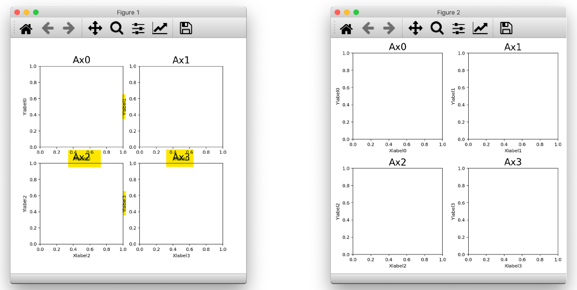
다음 그림에서 왼쪽 그림과 같이 축 표시가 서로 겹치게 되면 굉장히 보기 안좋아진다. 이를 오른쪽으로 바꾸는 방법은 굉장히 간단하다.
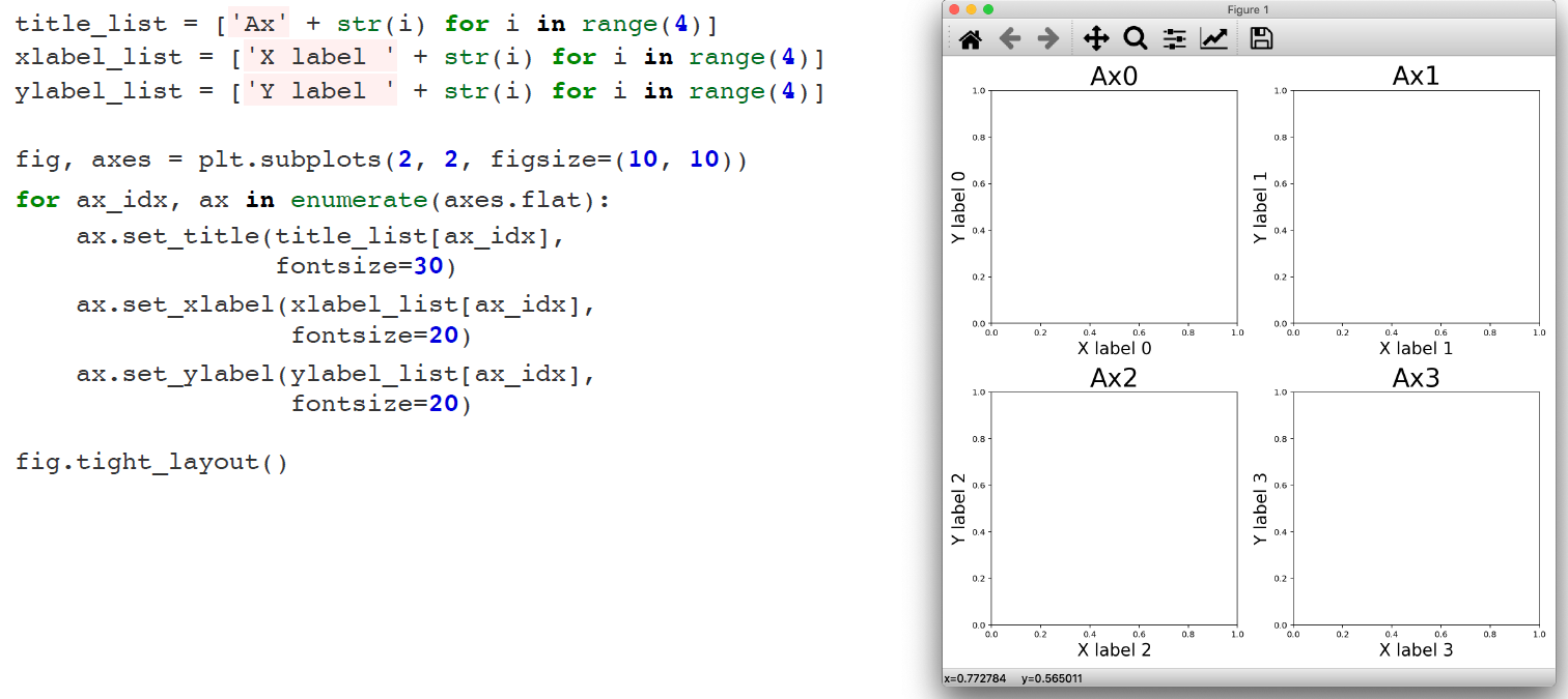
2) 축 간격 잡아주기
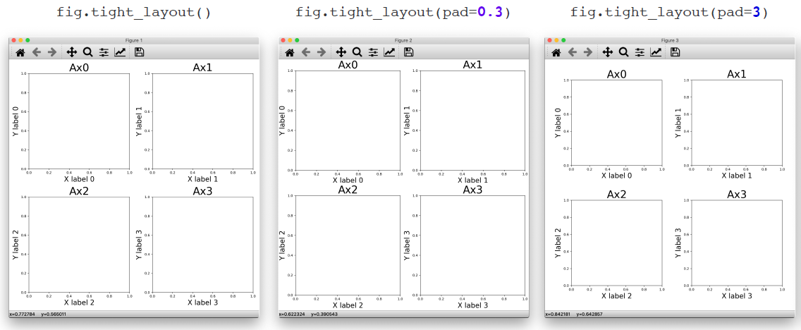
fig.tight_layout()
3) 확장하기
2. Axis
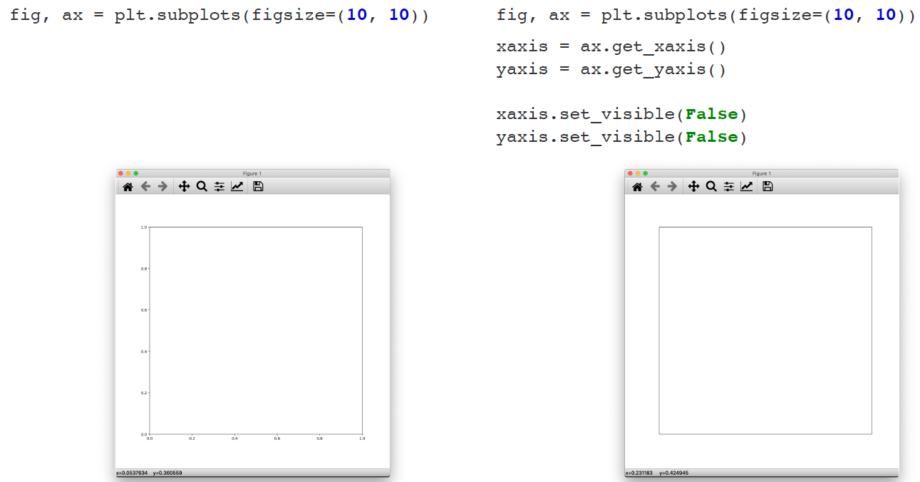
1) 눈금 간격 없애기
우리가 넣는 그림이 이미지인 경우, ax들의 눈금 간격을 없애주는게 깔끔하다
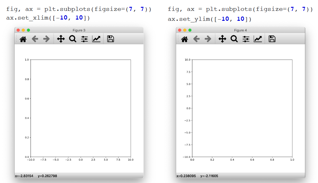
2) 눈금 범위 정하기
ax.set_xlim([-10, 10])
ax.set_ylim([-10, 10])
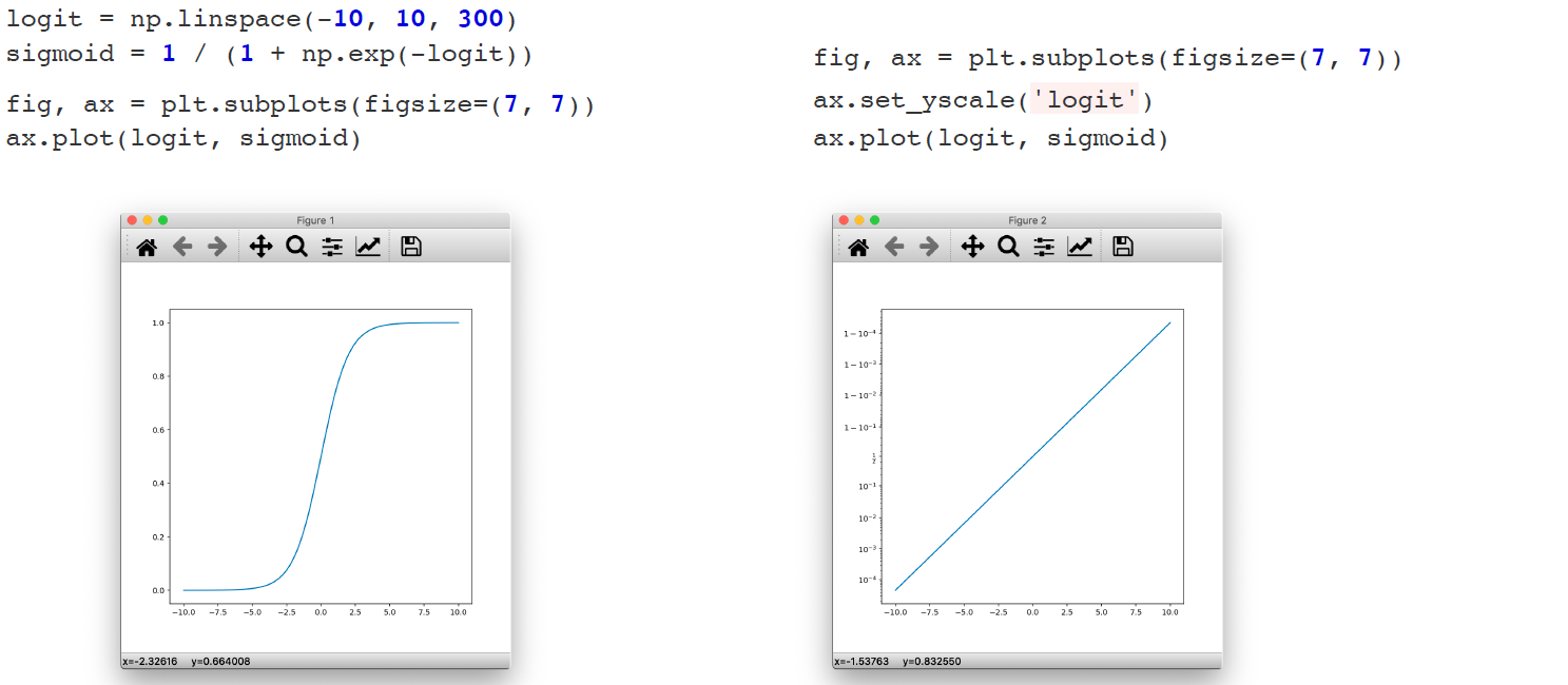
3) 눈금 스케일 정하기
ax.set_yscale('logit')
ax.set_yscale('log')
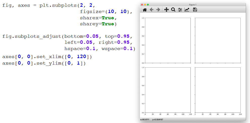
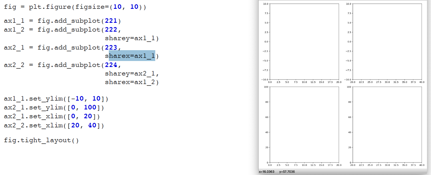
4) Axis sharing
# 일괄적으로 Axis share하려는 경우
fig, axes = plt.subplots(2, 2, figsize=(7, 7), sharex=True, sharey=True)
# 좀 더 자유로운 방법으로 Axis share하고 싶을 때
fig = plt.figure(figsize=(7, 7))
ax1 = fig.add_subplot(211)
ax2 = fig.add_subplot(212, sharex=ax1)
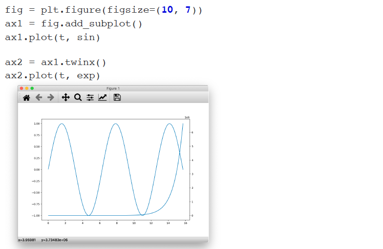
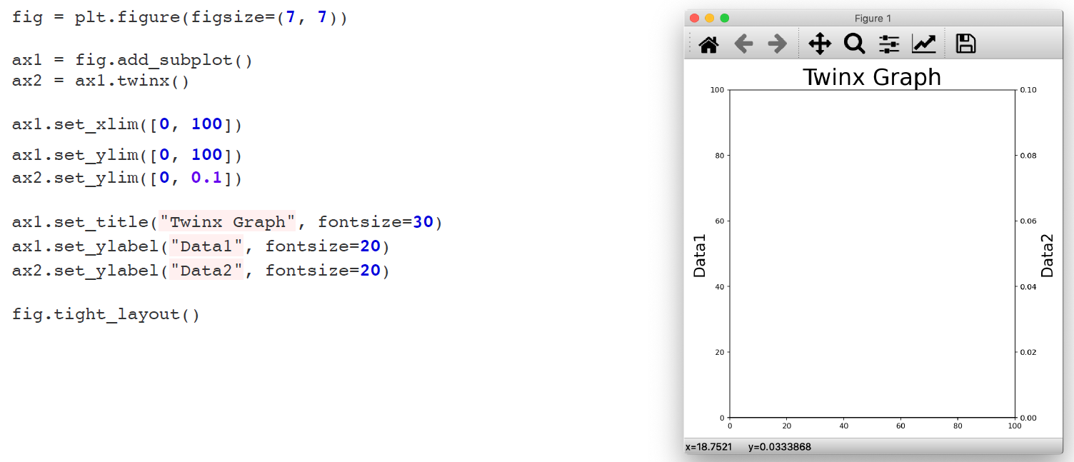
5) Different Y values
두 그림을 하나의 ax에 그리고 싶은데 scale 차이가 큰 경우 twinx()를 쓰면 좋다. 그럼에도 두 개의 ax 객체가 존재하는 것이기 때문에, 눈금 범위, 레이블 다르게 할 수 있다.
fig = plt.figure(figsize=(10, 7))
ax1 = fig.add_subplot()
ax1.plot(t, np.sin(t))
ax2 = ax1.twinx()
ax2.plot(t, np.exp(t))