
판다스 데이터 시각화하기
데이터는 보통 판다스를 사용해서 다루기 때문에 판다스 데이터를 시각화는 것이 중요합니다. 판다스의 시리즈와 데이터프레임은 기본적으로 plot() 함수를 내장하고 있습니다. 따라서 따로 맷플롯립을 불러오지 않고도 plot()함수를 사용해 데이터를 시각화 할 수 있습니다.
1. 데이터 준비하기
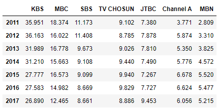
>>> import pandas as pd
>>> df = pd.read_csv('broadcast.csv', index_col = 0)
>>> df
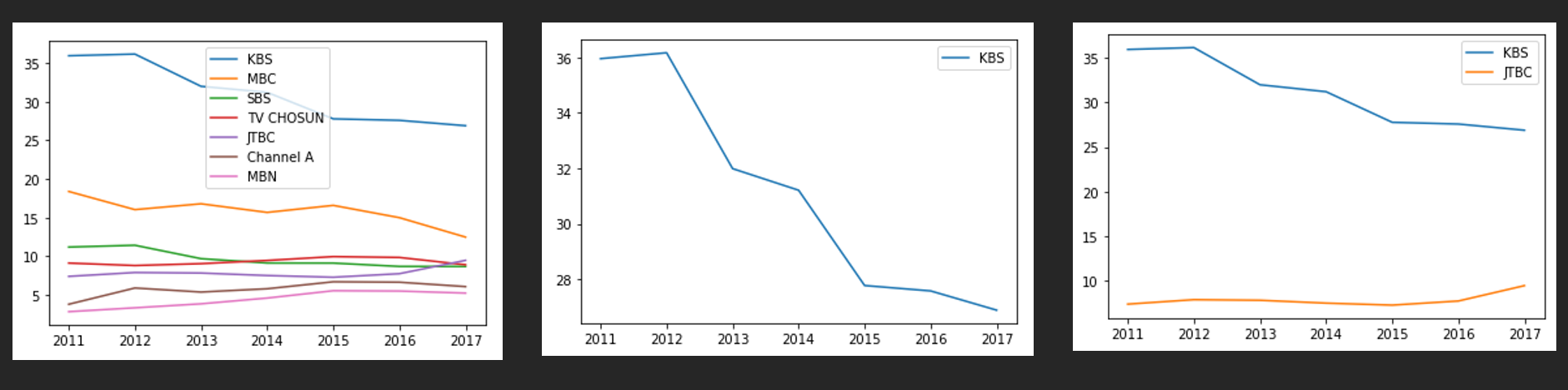
2. 선 그래프
>>> df.plot(kind='line') # line이 default값이기 때문에 생략 가능
>>> df.plot(y='KBS') # df['KBS'].plot()와 같다
>>> df.plot(y=['KBS', 'JTBC']) # df[['KBS', 'JTBC']].plot()와 같다
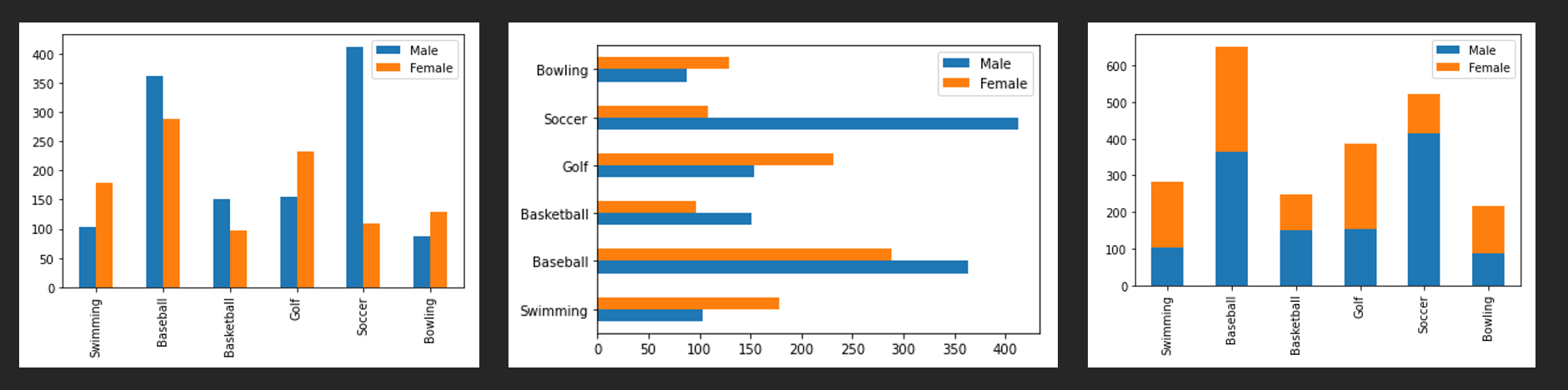
3. 막대 그래프
df.plot(kind='bar')
df.plot(kind='barh')
df.plot(kind='bar', stacked=True)
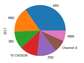
4. 파이 그래프
df.loc[2017].plot(kind='pie')
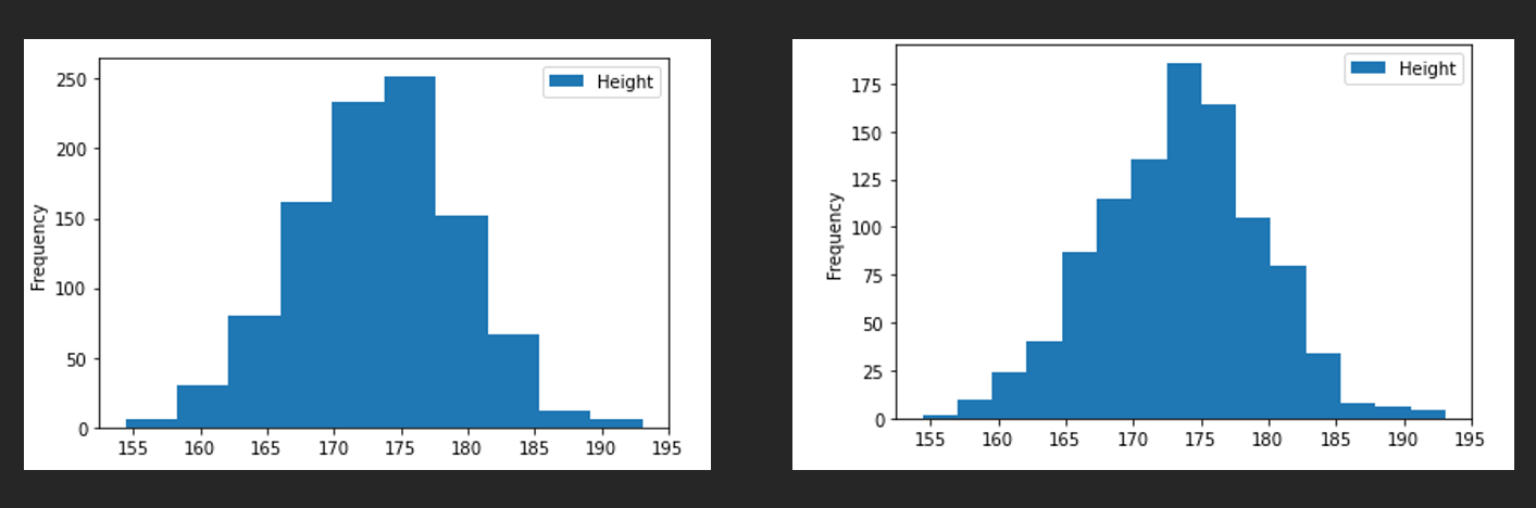
5. 히스토그램
df.plot(kind='hist', y='Height')
df.plot(kind='hist', y='Height', bins = 15)
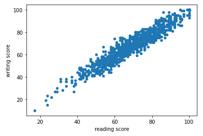
6. 산점도(Scatter)
df.plot(kind='scatter', x='reading score', y='writing score')
7. 박스 그래프
df['math score'].describe()
df['math score'].plot(kind='box')
df.plot(kind='box', y=['math score', 'reading score', 'writing score'])